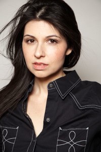
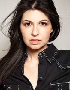
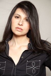
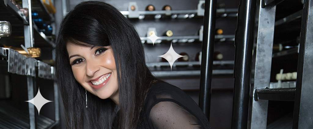
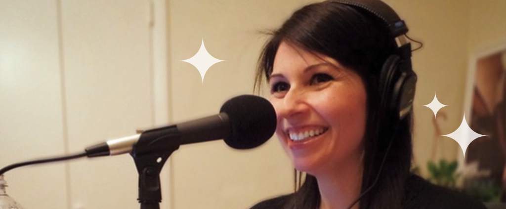
Here are more shots from my photoshoot with Eric Fischer (including the two I originally posted). Which ones are your favorites? Let me know which ones I should have him retouch and make awesomer (I’m hoping he’ll give me a cleft chin, goatee and blond highlights.)



i like the close-up of you in black
They’re ALL nice. You’re a beautiful woman.
#1 and #4. i think the first one is my favorite pic of you ever; it doesn’t even need to be retouched.
These are already in my order of preference. The top one’s a winner. I’m not sure what commercial purpose the others serve, apart from just enjoying your beauty.
The second portrait should be a magazine cover, she is captured in a beautiful moment. Best photo.
I vote for 2 and 4. Not necessarily your regular style, but sultry without irony suits you. Go for it. If you’re a genius now, you beatiful smile may not be where you want to stay.
i like the close-up of you in black
They're ALL nice. You're a beautiful woman.
#1 and #3 in black.
These are already in my order of preference. The top one's a winner. I'm not sure what commercial purpose the others serve, apart from just enjoying your beauty.
The second portrait should be a magazine cover, she is captured in a beautiful moment. Best photo.
I vote for 2 and 4. Not necessarily your regular style, but sultry without irony suits you. Go for it. If you're a genius now, you beatiful smile may not be where you want to stay.
99 is nice, shadows a bit harsh
067 very sexy
066 ditto
No comments on the rest, these are my favorites
some others with half face lit could make good B&Ws
Master Photographer cert. Fashion photographer 25 experience
I wish I had the chance to photograph you.
4,1,5,2,3 I like this shoot much better than the one with the sweater. You sort of have a Shiri Appleby vibe going on.
#1 and #3 in black.
99 is nice, shadows a bit harsh
067 very sexy
066 ditto
No comments on the rest, these are my favorites
some others with half face lit could make good B&Ws
Master Photographer cert. Fashion photographer 25 experience
I wish I had the chance to photograph you.
4,1,5,2,3 I like this shoot much better than the one with the sweater. You sort of have a Shiri Appleby vibe going on.
I really like the last picture on the bottom where there is a strand of hair touching your nose. It’s like I can imagine you saying, “Is there a hair on my nose?” and the photographer is saying, “No Alison! You are just imagining things… teehee!” I also really love the picture above that one. I would like a black and white glossy of that picture with your autograph saying, “Boinkity! Stop trying to tell me to cut my hair short! Look at how sexy my hair is long! You want me to get rid of this sexy hair? I don’t think so, buster!”
I pick #3 because you have a smile that can light up a room!
I really like the last picture on the bottom where there is a strand of hair touching your nose. It's like I can imagine you saying, “Is there a hair on my nose?” and the photographer is saying, “No Alison! You are just imagining things… teehee!” I also really love the picture above that one. I would like a black and white glossy of that picture with your autograph saying, “Boinkity! Stop trying to tell me to cut my hair short! Look at how sexy my hair is long! You want me to get rid of this sexy hair? I don't think so, buster!”
I can't see this first pic…it's missing! WTF…I blame Joe again! However, out of the rest of this group, I pick #3 because you have a smile that can light up a room!