I’m getting burnt out on this. It was fine the first time. But I do think that having a few unexplained references is better than one. It suggests the larger picture, hopefully makes you curious what it’s all about, whereas one thing just seems odd like, “Why the pencil?” or “Why the glasses?”
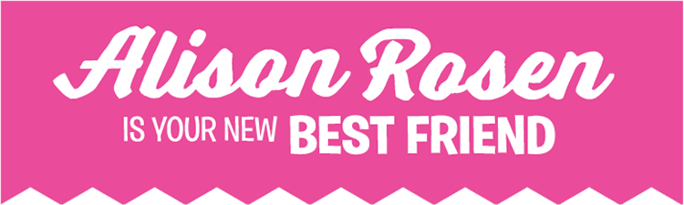
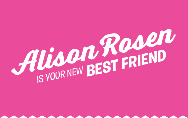
I agree about the .com. That’s a helluva long address. Are you really going to use that? Why don’t you put it under the n in Rosen? Or a small font http://www.alisonrosen.com on the bottom right instead? I’d also like to see an eyes open version to compare.
You’ve got to go a lot farther back than Anna Nicole Smith’s show since her logo was inspired (as I was) by classic sitcoms such as “I Dream of Jeannie” and “Bewitched”.
I think the “.com” needs to stay because how are people going to realize it’s an internet show? Also, I don’t think it looks that similar to Anna Nicole’s show. Anna Nicole was blond with a lot of cleavage that didn’t appear in her logo, and Alison Rosen is brunette with not that much cleavage that DOES appear in her logo. That alone shows a distinct uniqueness! I think this latest version of the logo is great! If it looks busy, just move the duck to a different part of the logo…
I'm getting burnt out on this. It was fine the first time. But I do think that having a few unexplained references is better than one. It suggests the larger picture, hopefully makes you curious what it's all about, whereas one thing just seems odd like, “Why the pencil?” or “Why the glasses?”
I agree about the .com. That's a helluva long address. Are you really going to use that? Why don't you put it under the n in Rosen? Or a small font http://www.alisonrosen.com on the bottom right instead? I'd also like to see an eyes open version to compare.
You've got to go a lot farther back than Anna Nicole Smith's show since her logo was inspired (as I was) by classic sitcoms such as “I Dream of Jeannie” and “Bewitched”.
I think the “.com” needs to stay because how are people going to realize it's an internet show? Also, I don't think it looks that similar to Anna Nicole's show. Anna Nicole was blond with a lot of cleavage that didn't appear in her logo, and Alison Rosen is brunette with not that much cleavage that DOES appear in her logo. That alone shows a distinct uniqueness! I think this latest version of the logo is great! If it looks busy, just move the duck to a different part of the logo…
She was definitely a big Texas girl. I thought she was quite pretty, but I would have had to explain all my jokes to her. Not good. Never done the lap dance thing. Either as a patron or a dancer. Probably never will.
She was definitely a big Texas girl. I thought she was quite pretty, but I would have had to explain all my jokes to her. Not good. Never done the lap dance thing. Either as a patron or a dancer. Probably never will.


This one is by far my favorite. Very nicely done! Don’t take a bow Kezilla, take two.
I don’t get the “.com” reference though.
Yeah, I’d remove the .com from there.And don’t put any more in there, it’s starting to look busy.
There’s one other thing: You might want to make sure that it doesn’t attract attention from E! due to similarities with this:
http://4.bp.blogspot.com/_HoBfxPG7cE0/Rc1jkoKexkI/AAAAAAAAACc/xLN7U3Nqe3Y/s400/anna%2Bnicole%2Bshow.jpg
This one is by far my favorite. Very nicely done! Don't take a bow Kezilla, take two.
I don't get the “.com” reference though.
Anna Nicole? lol Are you being serious, or is that a dig? BTW, you know Anna was from Houston? She got her BIG start here. :oS
Yeah, I'd remove the .com from there.And don't put any more in there, it's starting to look busy.
There's one other thing: You might want to make sure that it doesn't attract attention from E! due to similarities with this:
http://4.bp.blogspot.com/_HoBfxPG7cE0/Rc1jkoKex…
I’m getting burnt out on this. It was fine the first time. But I do think that having a few unexplained references is better than one. It suggests the larger picture, hopefully makes you curious what it’s all about, whereas one thing just seems odd like, “Why the pencil?” or “Why the glasses?”
I agree about the .com. That’s a helluva long address. Are you really going to use that? Why don’t you put it under the n in Rosen? Or a small font http://www.alisonrosen.com on the bottom right instead? I’d also like to see an eyes open version to compare.
See what happens when you ask for opinions?
You’ve got to go a lot farther back than Anna Nicole Smith’s show since her logo was inspired (as I was) by classic sitcoms such as “I Dream of Jeannie” and “Bewitched”.
I think the “.com” needs to stay because how are people going to realize it’s an internet show? Also, I don’t think it looks that similar to Anna Nicole’s show. Anna Nicole was blond with a lot of cleavage that didn’t appear in her logo, and Alison Rosen is brunette with not that much cleavage that DOES appear in her logo. That alone shows a distinct uniqueness! I think this latest version of the logo is great! If it looks busy, just move the duck to a different part of the logo…
Just my opinion dudes!!
I’m not positive, but I may have gotten a lap dance from Anna Nicole once when she was working at the Men’s Club… she was kinda heavy
Anna Nicole? lol Are you being serious, or is that a dig? BTW, you know Anna was from Houston? She got her BIG start here. :oS
I'm getting burnt out on this. It was fine the first time. But I do think that having a few unexplained references is better than one. It suggests the larger picture, hopefully makes you curious what it's all about, whereas one thing just seems odd like, “Why the pencil?” or “Why the glasses?”
I agree about the .com. That's a helluva long address. Are you really going to use that? Why don't you put it under the n in Rosen? Or a small font http://www.alisonrosen.com on the bottom right instead? I'd also like to see an eyes open version to compare.
See what happens when you ask for opinions?
You've got to go a lot farther back than Anna Nicole Smith's show since her logo was inspired (as I was) by classic sitcoms such as “I Dream of Jeannie” and “Bewitched”.
I think the “.com” needs to stay because how are people going to realize it's an internet show? Also, I don't think it looks that similar to Anna Nicole's show. Anna Nicole was blond with a lot of cleavage that didn't appear in her logo, and Alison Rosen is brunette with not that much cleavage that DOES appear in her logo. That alone shows a distinct uniqueness! I think this latest version of the logo is great! If it looks busy, just move the duck to a different part of the logo…
Just my opinion dudes!!
I'm not positive, but I may have gotten a lap dance from Anna Nicole once when she was working at the Men's Club… she was kinda heavy
She was definitely a big Texas girl. I thought she was quite pretty, but I would have had to explain all my jokes to her. Not good. Never done the lap dance thing. Either as a patron or a dancer. Probably never will.
To me it gives a sense of what the show has to offer, and it might entice me to come see what it’s all about.
She was definitely a big Texas girl. I thought she was quite pretty, but I would have had to explain all my jokes to her. Not good. Never done the lap dance thing. Either as a patron or a dancer. Probably never will.
To me it gives a sense of what the show has to offer, and it might entice me to come see what it's all about.
It has nothing to do with Anna Nicole herself. It has to do with the fact that the logo looks similar enough that it could generate a copyright issue.
It has nothing to do with Anna Nicole herself. It has to do with the fact that the logo looks similar enough that it could generate a copyright issue.